Component Guide
WYSIWYG-Compatible Blocks
Accordion
Accordions are expandable containers that are great for breaking up content into smaller, easily read sections.
Each accordion has a title, configured in the block tab in the editor sidebar, which should let the user know what to expect when they click on the accordion. Each accordion also contains content; this can include anything that can go inside a WYSIWYG.
Link List
Link Lists have two style options: Button (one or two column) or Link (one column).
Button Style: One Column
Button Style: Two Columns
Link Style
Butler Directory
The Butler Directory block pulls information for faculty and staff from the directory by username. Simply list the usernames of each individual you wish to display, separated by a comma. This list can be automatically alphabetized, if desired.

Design Blocks
Groups
Placing blocks inside a Group ensures they stay grouped together. This can be used to apply background colors, to keep images sorted together, and for all sorts of other users.
Groups may be transformed into Rows or Stacks, if desired.
These two paragraph blocks are in a group together.
This allows for them to be set together in a section with a different background color from the rest of the page.
Rows
Rows organize blocks horizontally.


Stack
Stacks organize blocks vertically. This works well combined with the Columns block, using one Stack per Column.
Columns
Columns allow sets of blocks to be displayed side-by-side. Most pages can fit no more than three columns comfortably.
Columns cannot be added inside WYSIWYG blocks.
This paragraph is in column 1.
This paragraph is in column 2.
Separators
Separators add a line to visually separate content. There are three styles available: Default, Wide Line, and Dots.
Default
Wide Line
Dots
Spacers
This invisible block can be used to add space between other blocks on the page. The height, or the amount of space added, can be adjusted. For example, below are two sets of Separators with Spacers in between. The first set has 50 pixels in between, while the second set has 150 pixels in between.
50 pixels:
100 pixels:
Full-Width Blocks
These blocks must be placed outside of a WYSIWYG. They should also not be placed inside accordions or design blocks, as they will not display correctly.
One Column: Two Buttons
This block allows for up to two buttons by default (up to three total), an optional heading, and a configurable background image with blue overlay.
Three Columns: Text and Links
This block allows for a heading, a description, and links arranged horizontally. Up to four links may be included, but this block generally looks best with just one or two links.
Two Column: Billboard
Allows for a headline, a brief overview, and up to twelve card items. Each card allows for an image, a headline, a description, and a link.


Two Column Cards
This block allows for a headline with two cards, each with a headline, image, and a link. The background design may be toggled off.
Title

Left Callout
Left Callout Link
Right Callout
Right Callout LinkTwo Column: Full-Width Image or Video
Allows for either a prominent image or video and Highlighted text. This block is always full-width. Includes a Kicker, a Headline, a Description, and up to four links.

Two Column: Header on Left; Text on Right
This block allows for a header on the left and text and media on the right.
Headline
Allows for one paragraph of body text. Can include images.

Two Column: Quote
This is a two column callout with a quote in one column and an image in the other. The layout can be flipped; the quote can be on the left and the image on the right, or vice versa. This block may contain multiple quotes, and it is often used with the layouts alternating, as illustrated below.
Kicker Text
Kicker Text
Two Column: Two Buttons
This block can display a heading with adjustable heading level, description, and up to two links. The links may be styled as callout text links or as buttons. A solid color background may also be added.
Without Background, Text Link Style
Without Background, Button Link Style
With Bright Blue Background, Text Link Style
With Bright Blue Background, Button Link Style
Two Column: Text/Buttons/Image
This component is meant to serve as a callout for important information and up to 2 CTA links, where the first link is solid and the second is ghosted. The image can go on the left or the right.

Events
This block pulls events from events.butler.edu into a feed and displays the first four alongside a link to view all applicable events. It can be set up to pull only events from a specific category or with a specific tag. If there are no applicable events to display, the block will automatically hide itself.

Full Width Video/Image
This component features a video or image that takes over the screen as the user scrolls. It also allows for up to two lines of large text for emphasis above the image/video.
Because this component has a large impact on a page, it should be used with caution and reserved for special circumstances.
Two Lines of Text
Headline Text

Gallery Carousel
Carousel allowing for up to 4 slides of content, each containing a background image, an optional cutout image, a card with kicker text, a headline, body, and up to one text button. Includes an optional blue overlay.

Gallery – Modal
An eye-catching and large-scale way to show off a number of Butler photos. It has space for a medium length headline and a CTA to draw users to open up the modal window to view photos and their captions.
Description Here


Quick Facts
Tiles with several patterned background options designed for displaying two to three basic stats and facts.
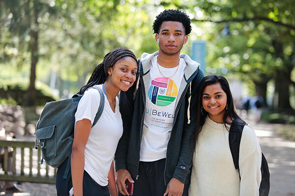
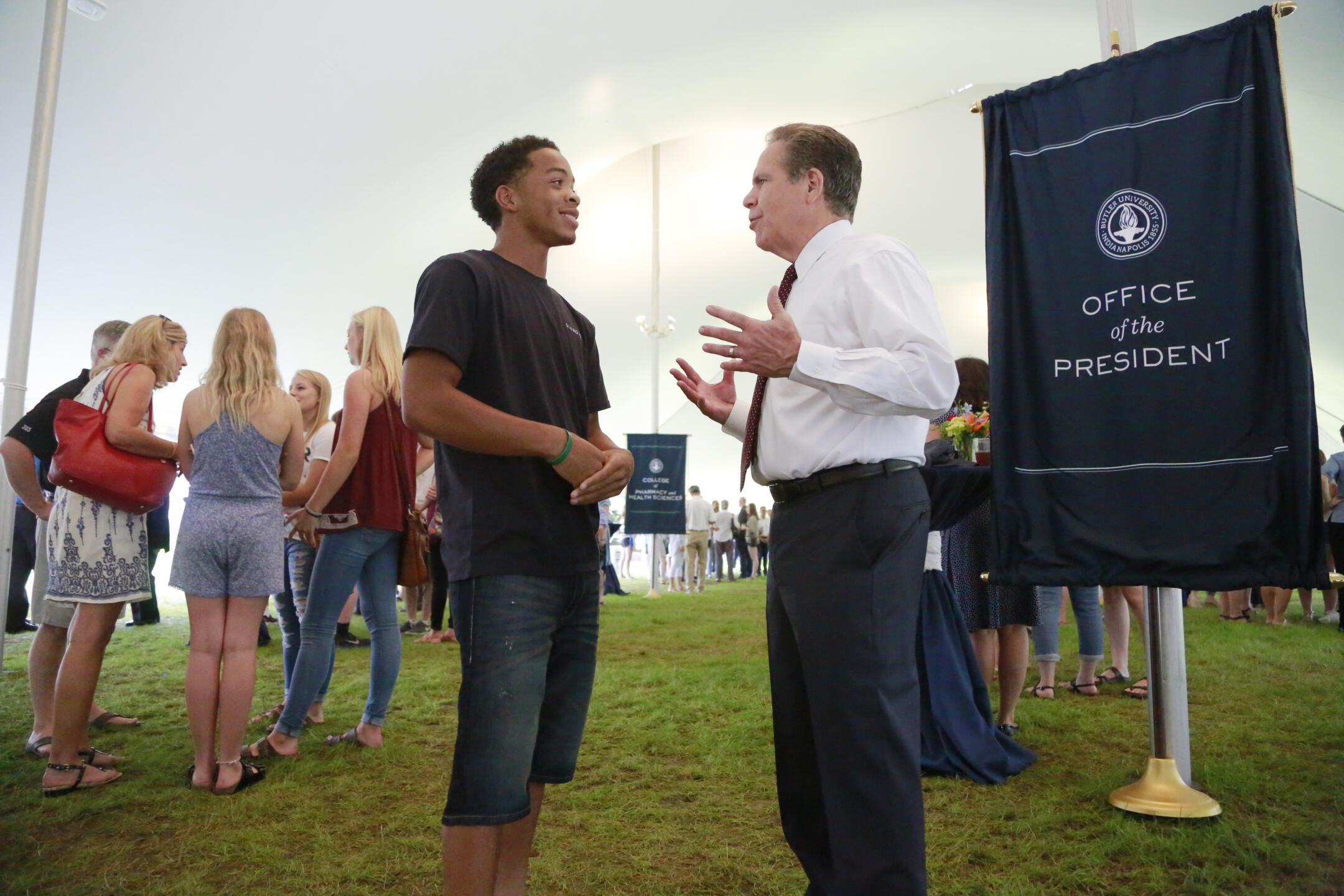
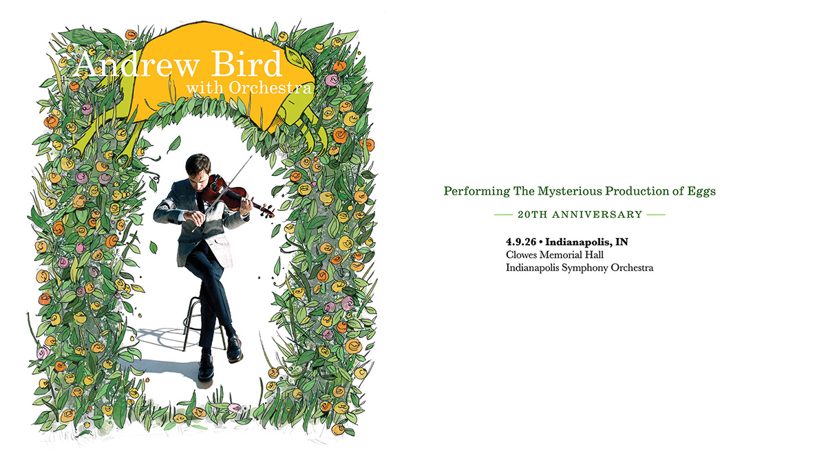
News
Pulls and displays stories from stories.butler.edu. Can be configured to pull only stories from a specific category or tagged with a specific tag.
This is a working reflection on the future of higher education and what it may require of institutions like Butler. It is intentionally provocative in places and is not a plan or a set of decisions. Rather, it reflects the level of ambition I believe this moment demands. I share it in the spirit of […]
Ready to experience college life beyond the campus tour? Here are three reasons why you should consider an overnight pre-college program experience as a high schooler.
As Indianapolis welcomes the 2026 NCAA Men’s Final Four, Butler University students are not just spectators—they are part of the operation. Through a new course, SPM 390: Special Topics in Sports Media: Large Scale Sports Events – Inside the Road to the Final Four, Butler is turning one of the nation’s biggest sporting events into […]
Scrolling Ticker
Displays horizontally scrolling, looping text.
Scrolling Ticker
Scrolling Ticker
Scrolling Ticker
Scrolling Ticker
Scrolling Ticker
Scrolling Ticker
Scrolling Ticker
Scrolling Ticker
Scrolling Ticker
Scrolling Ticker
Footer Contact
A box with three columns designed for displaying contact information such as phone numbers, email addresses, and office locations. Can include social media icons.
Heroes
Heroes are to be used sparingly and are to be reserved for landing pages or other special cases. They replace the normal H1 on a page.
Hero – Alternate
Can feature an image or a soundless video. Blue overlay cannot be removed. Two layout options: Short and Tall.
Short Layout
Tall Layout
Hero – Standard
Includes a full-color background image. May include up to two hero button links.
Headline
Sub Headline
Description